

ALIF Bitumex
Strong foundations: a corporate site for a regional bitumen supplier
Natana Publishing needed an identity that could carry a publishing house: a mark that works small on a book spine, large on a storefront, and consistently across the paperwork that a publisher signs every week.
The mark is built from three stacked waves — pages turning, and a nod to the sea that connects the region’s readers. It pairs a confident wordmark with a restrained palette of deep navy and signal red.
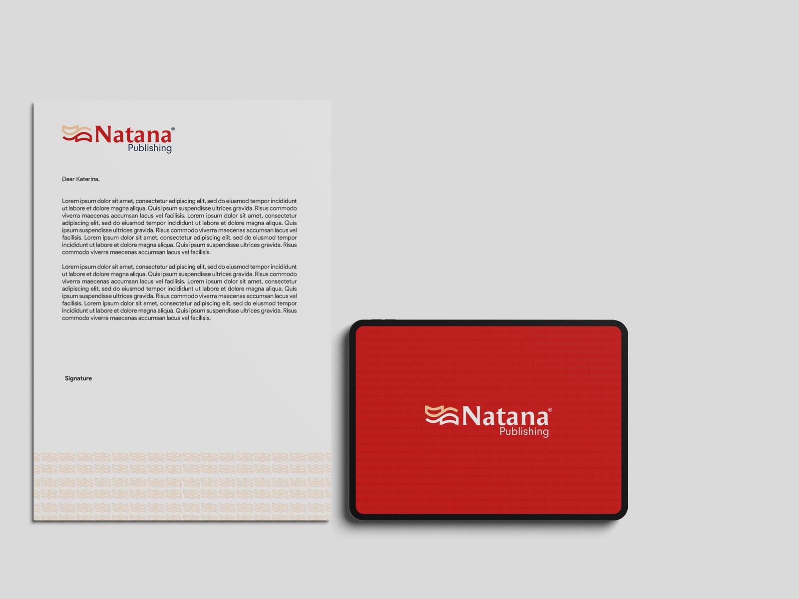
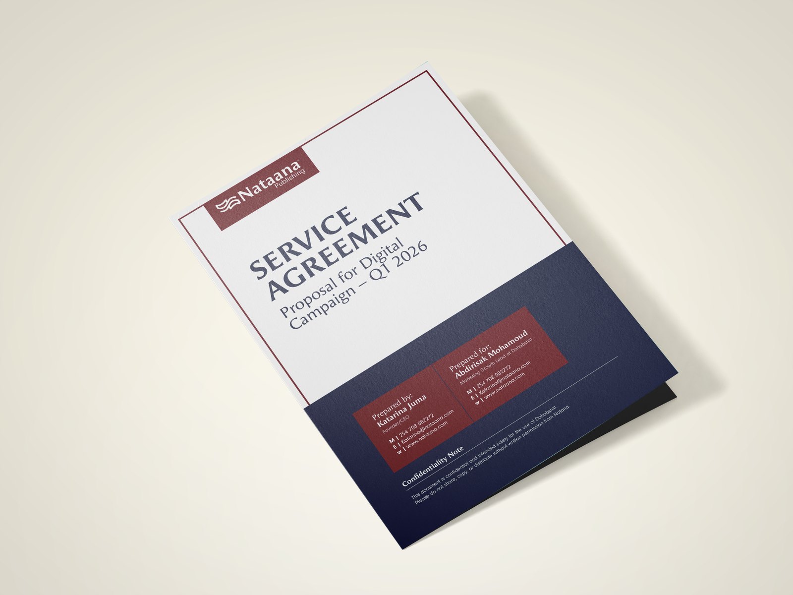
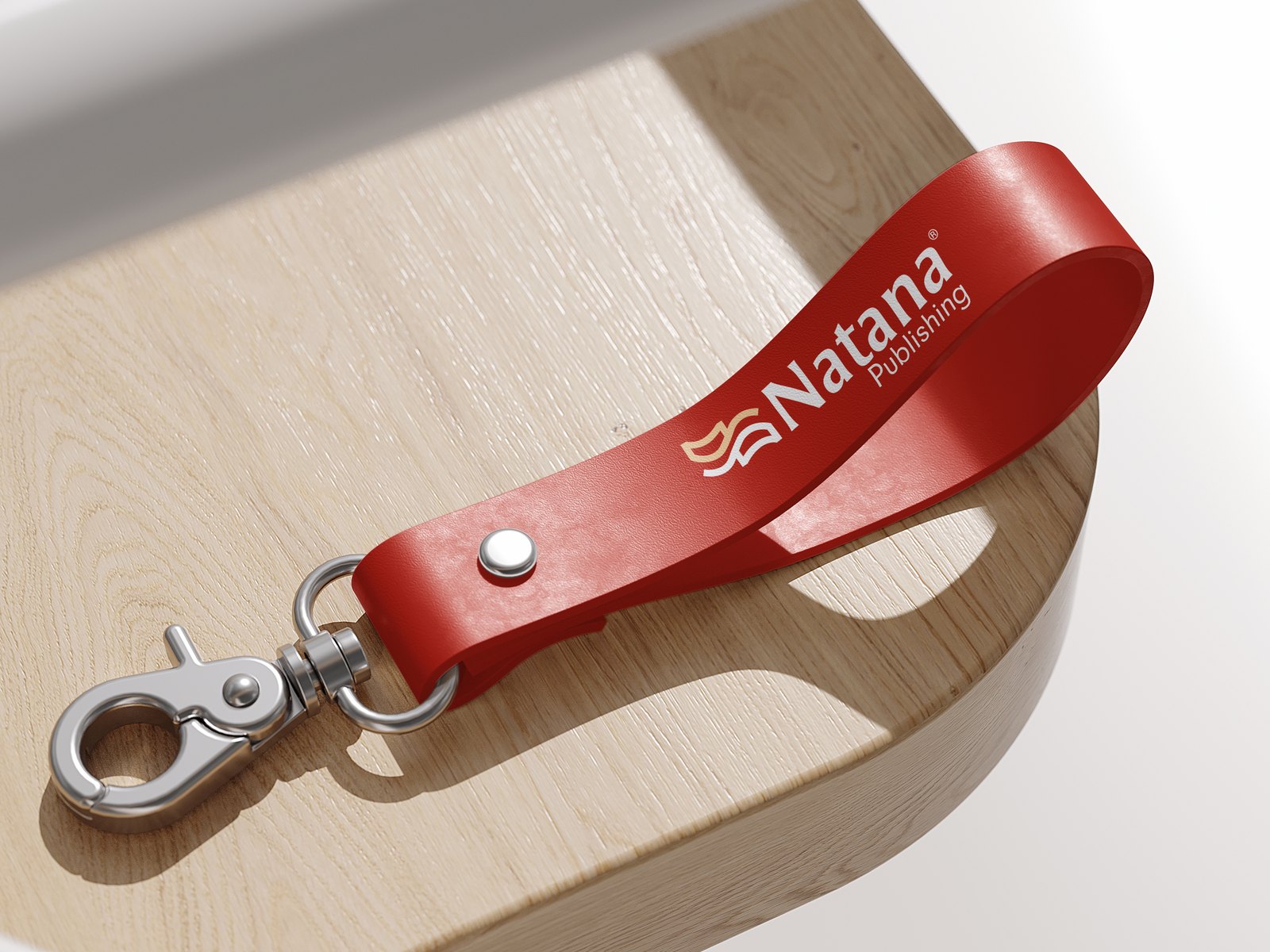
One system that holds together across print, signage and everyday documents — so Natana looks like an established publishing house in every room it enters.
More work
Strong foundations: a corporate site for a regional bitumen supplier

Books that carry a nation’s voice forward

Connecting your world, one shipment at a time